


)
Soothing colors for living spaces
Harmony and relaxation through targeted color selectionColors have an immense effect on our mood and well-being. Carefully selected color combinations can turn living spaces into places of peace and relaxation. Colors influence our perception, our emotions and even physical processes. If you consciously use the effect of colors, you can transform your home into a harmonious oasis of well-being.
The importance of colors in the living room
The psychological effect of colors has been scientifically proven, as shown, for example, by the Color and Health Study. The study shows that targeted color and lighting design in intensive care units significantly improves the well-being of patients and staff and reduces medication consumption by an average of 30.1%.
In general, it has been observed that certain color tones can stimulate the metabolism, lower or raise blood pressure and even influence breathing. While cool colors and light tones have a calming effect, warm colors from red to yellow can be stimulating. It is therefore important to choose a balanced color scheme, especially in the living room.
Calming colors: Which colors have a relaxing effect?
:format(jpeg) "Blue fish")
Blue stands for peace, harmony and trust and has a calming effect on the mind. In interior design, color is often used to make rooms appear larger, more elegant or more relaxing. Light shades of blue lend freshness and expansiveness, while darker nuances such as navy or royal blue provide elegance and depth. Especially in combination with white, gray or beige, blue creates a modern and elegant look. Blue accents can be enhanced and an atmospheric ambience created with targeted lighting.
:format(jpeg) "Green landscape")
Green stands for nature, freshness and balance and has a grounding and regenerating effect on the mind. In interior design, color is often used to create a natural, harmonious and lively atmosphere. Light shades of green such as mint or sage lend rooms a sense of lightness, while darker nuances such as emerald or forest green radiate elegance and depth. Combined with wood, off-white or beige, it creates a stylish and balanced ambience. Suitable lighting concepts can attractively emphasize green accents and create a relaxing, natural atmosphere.
:format(jpeg) "Rose flower")
Pink stands for gentleness, security and emotional warmth and has a calming effect on body and mind. In interior design, color is often used to create a harmonious and inviting atmosphere. Delicate rose tones such as powder pink or dusky pink look particularly soft and homely, while stronger nuances such as mauve or blush lend elegance and depth. Pink is even more effective when combined with light shades of white and woody natural tones. A must-have is the shade in shabby chic, the little sister of the vintage style. Pastel shades and pink nuances are preferred here.
:format(jpeg) "Violet lavender")
Violet combines elegance with relaxation and radiates creativity and mysticism at the same time. In interior design, the color is used to create a luxurious, calming and inspiring atmosphere, e.g. in Art Deco style. Light violet tones such as lavender or lilac have a gentle and refreshing effect, while darker nuances such as eggplant or plum lend the room depth and sophistication. In combination with calm, light tones such as cream, a sophisticated and harmonious room concept is created. You can perfectly emphasize purple accents with targeted area lighting.
Good to know: The interplay of primary colors & secondary colors
:format(jpeg) "Color wheel")
For interior design, it is helpful to be aware of the interplay between primary and secondary colors. Primary colors are red, blue and yellow, secondary colors are green, orange and violet. The following applies to the combination
- Neighboring colors in the color wheel harmonize well with each other.
- Complementary colors that are opposite each other on the color wheel are also perceived as pleasant.
- The room concept should focus on a calm basic tone such as white, beige, light brown or gray and complement 1-2 colors from the color wheel. Warm shades harmonize together, as do cool ones.
Harmonious colors for the home: how to create a calming atmosphere
As a rule of thumb: combine a main color with a secondary color and an accent color - ideally, for example, a simple main color such as beige, an expressive secondary color such as blue and an accent color such as petrol. This creates harmonious transitions that round off the overall look of the room and do not overtax the eye or the mind.
:format(jpeg) "Bedroom")
Soft blue and green tones in combination with beige and warm natural tones create a calm and grounding atmosphere that promotes relaxation and deep sleep. While blue calms the mind and conveys expansiveness, green brings a natural freshness and balance to the bedroom. Combined with soft lighting, this creates a harmonious sleeping environment that promotes relaxation.
:format(jpeg) "Living room")
The combination of earthy brown tones, beige and off-white with a calming accent color such as green creates a cosy and inviting atmosphere in the living room. Good to know: In combination with wood and natural materials, green enhances the organic look, while a modern touch is created in harmony with metal or concrete elements.
:format(jpeg) "Study")
A study in subtle and neutral colors such as beige, light grey or light brown creates a calm and focused atmosphere that supports productive work. The restrained tones are unobtrusive and promote mental clarity without being distracting. Green plants create lively accents, improve the indoor climate and ensure a natural balance in the work area.
Wall color tips: The right choice for a relaxed home
When choosing the right wall color, you should first consider the desired room effect - light tones visually enlarge, dark shades create depth and coziness. The lighting conditions play a decisive role: natural light makes colors look different than artificial lighting. It is therefore worth testing color samples on the wall to see how they look depending on the time of day and surroundings. In addition, if furniture and accessories are already present, the wall color should support the color concept and not introduce yet another color, as rooms can otherwise quickly appear restless.
Cheerful and positive colors: lift your mood and feel the energy
:format(jpeg) "Yellow sunflowers")
Sunny yellow radiates optimism, energy and joie de vivre, can lighten the mood and also promote creativity. The color has an activating and invigorating effect without being obtrusive and conveys a feeling of warmth and security. In interior design, yellow creates a friendly atmosphere and makes rooms appear brighter and more inviting.
:format(jpeg) "Orange leaves")
Orange stands for creativity, joie de vivre and warmth and has an invigorating effect on the psyche. The color promotes a positive mood, increases the joy of communication and can also have an inspiring and motivating effect. In the interior, orange creates a cozy and energetic atmosphere that invites you to relax and socialize. The color looks particularly harmonious in combination with neutral tones such as beige, cream or grey, which gently balance out its radiance.
:format(jpeg) "Red sunset")
Red has a stimulating, passionate and powerful effect and can strongly stimulate the senses. The color increases energy, dynamism and attention, but should be used sparingly so as not to be overwhelming. In living rooms, red can be used specifically as an accent color in the form of cushions, carpets or individual wall surfaces to convey warmth and elegance. It looks particularly harmonious in combination with neutral tones such as beige, gray or off-white, which balance out its intensity.
Cheerful colors for the home: How to bring color into play
Warm colors are best used as accents in the interior to create cheerful vibes and set highlights that stimulate and inspire.
:format(jpeg) "Yellow kitchen")
A rich sunny yellow brings cheerful vibes to the kitchen interior. You are welcome to use large areas here, for example with a yellow wall or yellow curtains. In combination with light tones and wood, the feel-good flair is perfectly rounded off.
:format(jpeg) "Orange furniture")
The color orange also brings a touch of joie de vivre into our living spaces. In a bright interior, for example, a bright orange sofa stands out in a contrasting way and automatically becomes the cozy focal point of the room.
:format(jpeg) "Red chair")
Since red is such a strong color, it is best used for accentuation. In a light concept with wood nuances, for example, it looks good when individual decorative elements such as pictures, vases and cushions pick up on the tone.
Furniture & colors in the living room: The right choice for your room design
:format(jpeg) "Furniture living room")
The living room is the central place to relax and feel good, which is why the choice of furniture and colors plays a decisive role. Natural materials such as wood, linen or velvet create a warm and inviting atmosphere. Light shades from off-white to cream and soft nuances in beige also harmonize with a colourful wall design and create a harmonious overall look. Soft fabrics and comfortable upholstery enhance the feeling of security. Rounded off with atmospheric lighting, the result is a cozy living space that radiates peace and comfort.
:format(jpeg) "Bedroom furniture")
The bedroom should be a place of retreat that promotes relaxation and rest - so the choice of furniture and colors is particularly important. Soft, harmonious shades such as beige, light gray or powdery blue create a calming atmosphere and support restful sleep. Natural materials such as wood, linen or cotton reinforce the feeling of security and warmth. Clear, simple shapes and an uncluttered environment also contribute to a sense of calm and give the room an airy and light feel. Atmospheric lighting with warm light rounds off the relaxed ambience perfectly.
:format(jpeg) "Study furniture")
A well-furnished study should create a calm and focused atmosphere that supports concentration and efficiency. Clear lines and functional furniture provide structure, while subtle colors such as light gray, beige or sand create an unobtrusive environment. Natural materials such as wood and metal give the room a high-quality and professional look. Ergonomic furniture and an uncluttered design help to minimize distractions and promote a productive way of working. Complemented by targeted lighting and green plants, a balanced working environment is created that increases both inspiration and well-being.
:format(jpeg) "Kitchen furniture")
The kitchen is not only a functional work area, but also a social meeting place, which is why the choice of furniture and colors should be a balanced mix of practicality and coziness. Light shades such as off-white, sand or soft gray make the room appear open and friendly, while warm wooden elements create a homely atmosphere. Smooth surfaces and clean lines create a modern and uncluttered look, while natural materials such as wood or stone add a warm, authentic touch. Furniture with well thought-out storage space makes everyday life easier and brings structure to the room.
:format(jpeg) "Effect of colors")
The effect of colors on the eyes: Which colors are good for relaxed vision?
Colors not only influence our mood, but also the fatigue and relaxation of our eyes. While some shades have a calming effect and promote concentration, others can strain the eye more quickly.
Blue and green shades: good for the eyes
Colors influence our well-being and our concentration - blue and green tones are particularly pleasant for the eyes. While blue is associated with clarity and calm, green has a balancing and calming effect. Both colors reduce visual fatigue as they gently hit the eye in the natural light spectrum. This is why they are often used in work areas or quiet zones to create a relaxed atmosphere.
Why neutral colors relax the eyes
Neutral colors such as beige, grey or soft earth tones create a harmonious environment without visual overstimulation. They reflect the light in a pleasant way and thus prevent rapid eye fatigue. In living and working spaces in particular, subtle color tones help to create a calm, unagitated atmosphere in which the eye can relax.
:format(jpeg) "Color psychology")
Color psychology: How colors influence our mood and behavior
Colors have a profound effect on our perception and our well-being. They influence emotions, create atmosphere and can even control our behavior. Whether calming, invigorating or inspiring - every color triggers certain associations and contributes to how we feel in a room.
Colors as a symbol for emotions and energies
Each color conveys its own meaning and energy. Red stands for passion and dynamism, yellow has an invigorating and creative effect, while blue symbolizes calm and clarity. Warm shades create a sense of security and closeness, while cool colors provide freshness and concentration. The targeted selection and combination allows rooms to be designed according to the desired mood.
Colors that convey confidence and calm
Soft blue and green tones have a calming effect and create a relaxed atmosphere, ideal for living or working areas. Neutral colors such as beige, grey or pastel shades convey consistency and confidence without overwhelming the eye. Such colors are the perfect choice, especially in rooms where relaxation and well-being are paramount. Example: A bedroom with walls in calm sea tones combined with a bedside lamp in a neutral color such as beige or pastel tones.
)
The right lighting for a color-coordinated room
A well-thought-out lighting concept is essential to show off the colors in a room to their best advantage and create the desired atmosphere. Light not only influences our perception of colors, but also our sense of well-being. The right combination of different light sources can be used to specifically support the color concept.
)
Balanced lighting consists of three components: general lighting such as ceiling lights, area lighting such as pendant lights and wall lights and accent lighting such as LED strips. While general lighting ensures uniform ambient brightness, area luminaires create targeted islands of light and highlight specific zones in the room. Accent lighting, such as indirect light or decorative luminaires, emphasizes colors and creates depth.
)
Targeted area lighting, such as table lamps, floor lamps or spotlights, creates islands of light that underline the color concept of the room. Wallwashers or indirect lighting create gentle color transitions, while directional lighting emphasizes certain accent colors. For example, a colored painted wall area can be accentuated even more with a targeted luminaire.
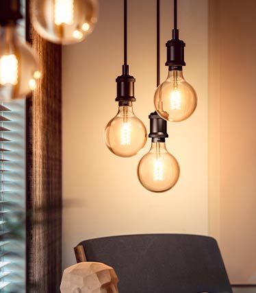
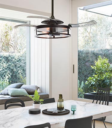
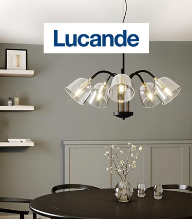
 "PH 5 Mini from Louis Poulsen")
 "Nuindie mini")
 "Trio Pastel")
 "Hotel by Nowodvorski Lighting")
 "Tonka from Lindby")
 "Ellen from Nordlux")
The right light color for different room areas
The color temperature of the lighting plays a decisive role in the effect of the room. Warm white light (approx. 2700-3000 K) creates a cozy atmosphere and is particularly suitable for living and sleeping areas. In work areas such as offices and kitchens, on the other hand, neutral white or universal white light (approx. 4000 K) is ideal as it promotes concentration. Lights with CCT function, such as those available from Lucande, Philips Hue, Osram or Paulmann, allow the light color to be changed depending on the time of day and requirements. Dimmable luminaires offer additional flexibility.
Optimal color perception with good color rendering
To ensure that colors in the room appear authentic and intense, a high color rendering index (CRI) should be taken into account when selecting light sources. A CRI of Ra 100 corresponds to true-to-life color rendering, while values from Ra 90 are considered very good. Light sources with a high CRI ensure that wall colors, furniture and decoration unfold their full effect and do not appear distorted.
Lights as discreet helpers or design accents
The choice of luminaires influences the room design. Simple, functional lights blend unobtrusively into the overall picture, while colorful or designer models can be used as deliberate accents. For example, a colored table lamp or a simple decorative LED strip can complement the color concept and create specific highlights.


 "Lights from Offwhite")
 "Dopamine Decor")
 "Earth-colored lamps")
 "Pastel lamps")
 "Natural materials")
 "Trend colors")